Creating a website nowadays is much less complicated than it was a decade ago. Free platforms such as WordPress and paid website building programs allow beginners to create beautiful websites in a relatively short period of time.
However, optimizing the website for conversion and user experience is a totally different matter. To help you figure out the website optimization game, take the time to learn some of these mind-blowing web design facts. Each provides insight into subtle changes that you could make to improve your website.
BUCKLE UP FOR THESE 29 MIND-BLOWING WEB DESIGN FACTS

1. THE AVERAGE ATTENTION SPAN HAS DECREASED FROM 12 TO 8 SECONDS
A goldfish, at 9 seconds, has a longer attention span than the average internet user. You must deliver the content to the audience in the shortest amount of time possible. Otherwise, you risk having a high bounce rate and the potential customer leaving to get what they need elsewhere.

2. MOBILE DEVICES MAKE UP TWO THIRDS OF WEB USAGE
Advancements in mobile devices means surfing the web on the go is more common than the desktop environment. It’s a no-brainer to optimize your website for mobile use so that the UX is pleasant to use.
3. LISTS ARE BETTER THAN LARGE PARAGRAPHS
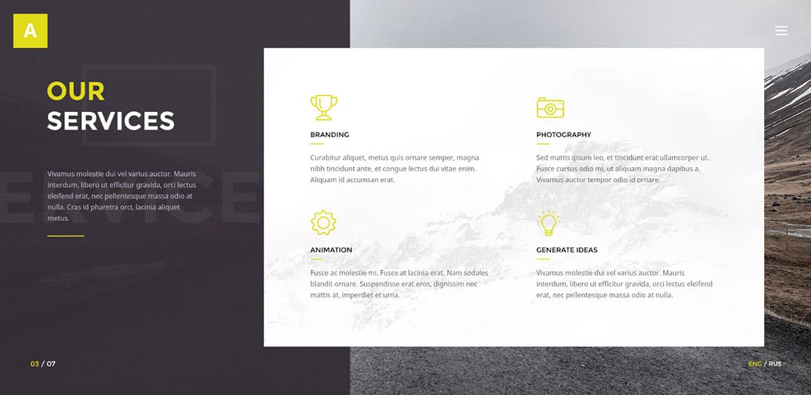
Website experts know that a text-heavy page is great for SEO, but too much text is counter-productive for actual human readers. Huge chunks of text can look daunting to visitors. Instead, try using lists, bolding, and descriptive headers to make the text easier to skim.

4. DEMOGRAPHICS PLAY A HUGE ROLE IN USER BEHAVIOR
One-size-fits-all websites will end up providing a non-optimized experience for a majority of your users. You must study your visitor demographics and create a website that they will respond to positively.
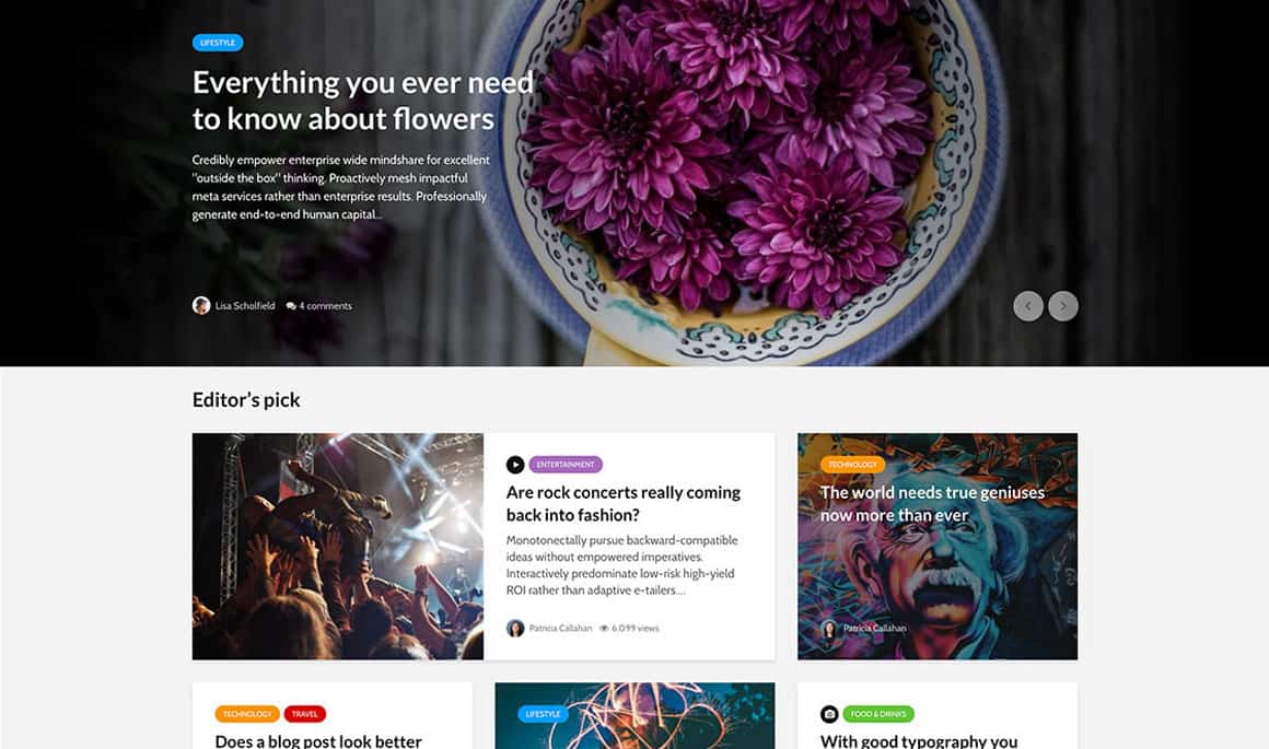
5. 7 OUT OF 10 CONSUMERS FIND A COMPANY VIA THE BLOG
A blog is a great way to attract new customers in an organic way. When designing your website, there is no excuse for not having a blog. If you release just one piece of content per week, you’ll have a comprehensive collection of content for new consumers to digest within a few months.
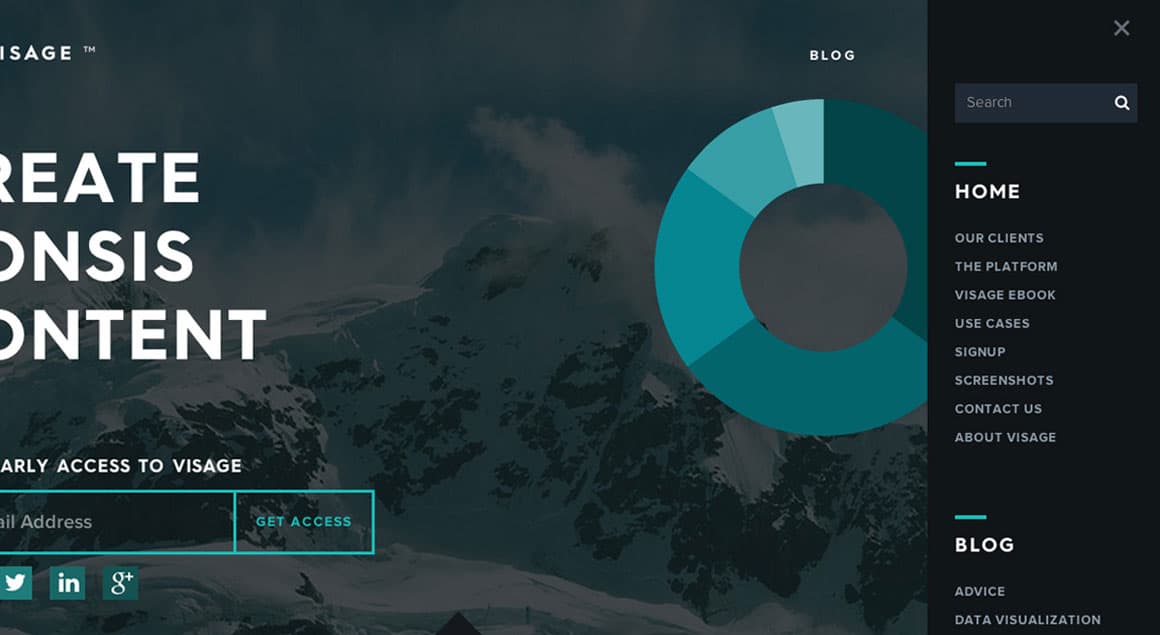
6. 50% OF REFERRAL WEBSITE VISITORS INITIALLY USE THE MENU
This statistic backs up the point that your navigational menu must do a great job of helping new visitors orient themselves. A cumbersome navigational menu can be highly frustrating and cause visitors to leave.
7. ON A DAILY BASIS, 2.9 BILLION GOOGLE SEARCHES ARE EXECUTED
SEO must be one of the primary concerns when creating content. Do your keyword research to figure out what phrases people are searching for in your niche. With so many daily searches, the traffic potential is huge. At the same time, though, you shouldn’t sacrifice content quality in the pursuit of better SEO.

8. 73% OF VISITORS ARE HEAVILY INFLUENCED BY VIDEO
YouTube has aided the explosion of online video, and some consumers opt for video over text where possible. So try to find a way to use video to help persuade the customer on the merits of your products or services.

9. ONLY 0.5 SECONDS IS REQUIRED TO FORM AN OPINION
Once the website has loaded, the average user will take half a second to make up their mind on certain aspects of the website. Therefore, you must make a good first impression. The use of images, background theme, and content layout must be in line with the expectations of your average user.
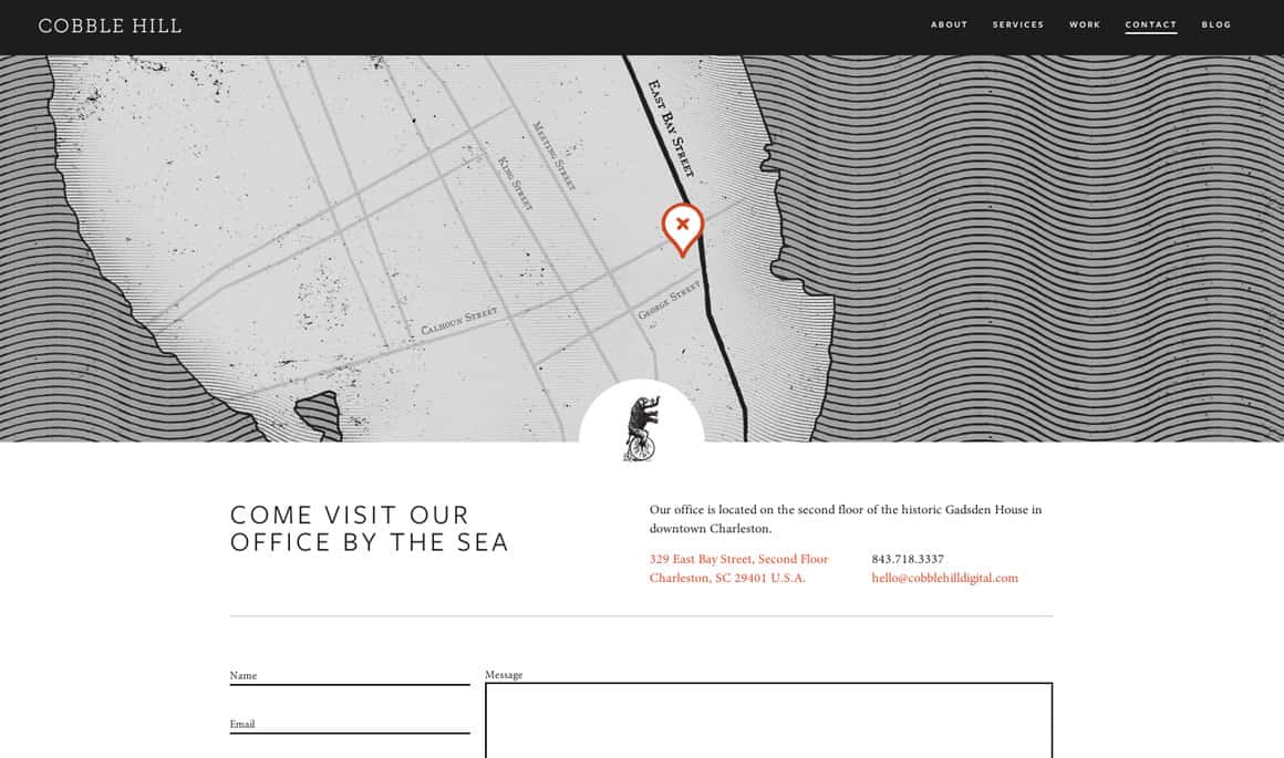
10. COMPANY CONTACT INFO IS IMPORTANT FOR 44% OF WEBSITE VISITORS
You must have a contact page that includes a phone number and other contact options. Up to 44% of visitors will leave the website if there is a lack of contact info. This might be out of frustration or simply because they don’t trust a business that doesn’t provide contact info.

11. WEBSITE DESIGN IS AN IMPORTANT FACTOR FOR DETERMINING CREDIBILITY FOR 48% OF VISITORS
Take a look at the top websites in your industry – is there a common theme regarding the website design? Try to stick with the design philosophy of the most reputable websites in your industry, especially if you are a new business that is fighting for recognition in the marketplace.
12. CUSTOMER REVIEWS ARE TRUSTED AS MUCH AS PERSONAL RECOMMENDATIONS BY 72% OF USERS
This shows that it’s important to highlight customer reviews. Your website design must prioritize customer reviews so that consumers can easily notice the review score. Also, a link to see the individual reviews should be easily accessible from the product page.

13. 47% OF USERS EXPECT WEBSITES TO LOAD WITHIN 2 SECONDS
Pay attention to website loading speeds – they must be under 2 seconds. Otherwise you run the risk of frustrating your website visitors. Most people would rather use your competitor than stick around for slow loading speeds.

14. 80% OF SMARTPHONE USERS ACCESS RETAIL CONTENT
Online retail store owners must have a mobile-friendly option that allows users to do everything they would via the desktop environment. Consider communicating to mobile clients differently as well, encouraging them to text or call with questions, which are more urgent forms of conversation.
15. 86% OF VISITORS WANT INFO ABOUT PRODUCTS/SERVICES ON THE HOMEPAGE
For sales optimization, the products or services you’re offering should be displayed on the homepage. Expecting buyers to navigate deeper into the website to see what products you have on offer is wishful thinking.

16. THE COLOR THEME IMPROVES WEBSITE RECOGNITION BY 80%
It’s a good idea to select a color theme and stick to it so that repeat buyers can recognize your website. Part of branding yourself is to come up with a color theme that is different to your competitors.

17. ABOVE THE FOLD IS NOT AS IMPORTANT
One of the most mind-blowing web design facts is that scrolling is accepted by most internet users nowadays. That means you do not need to have all your important content above the fold. If you feel that the website design would be better suited by elongating the content to below the fold then go for it!

18. IDENTIFYING YOUR TARGET DEMOGRAPHIC INCREASES INTEREST
When you are offering products to specific demographics, make sure to identify them in the marketing. Customers want offers that target them specifically, and finding your target demographics helps to increase your conversion rate.

19. EXIT POPUPS ACTUALLY WORK
Exit popups might seem like a frustrating part of website design for visitors, but they have been shown to add value. They are an effective way of capturing the email address of prospects that are about to slip through your fingers.
20. FORMS CAN BE BORING
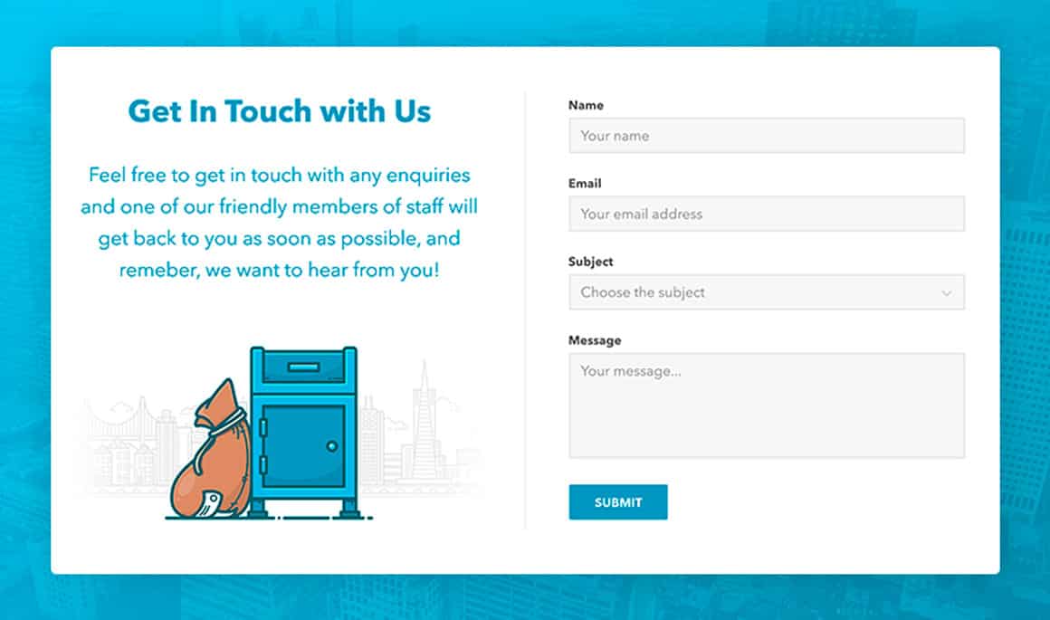
Maybe this isn’t one of those mind-blowing web design facts, since it’s actually pretty intuitive: filling out forms is no fun. Asking your audience to fill out a long form is an all-to-easy way to increase your bounce rate. When designing a form, you should only ask for the info that’s actually needed. Also consider removing a few of the form fields and asking for that info at a later date.

21. EVERY DAY 2.7 MILLION BLOG POSTS ARE PUT ONLINE
With such a high number of daily blog posts, it’s important to figure out how to stand out from the crowd. Instead of regurgitating content that is already published, try to create a new angle. This ensures you’re able to offer something fresh that the readers have never seen before.

22. DIGITAL INTERACTION INFLUENCES 56% OF MONEY SPENT IN THE OFFLINE ENVIRONMENT
Even if you are not getting the sales you were expecting at your online store, it might still be having a positive effect on offline sales. Therefore, continue to implement customer-friendly design choices like live chat and descriptive product entries.

23. AD BLOCKING COST ONLINE BUSINESSES $22 BILLION IN 2015
For advertisers, ad blocking is a big problem — but there are a few ways to overcome it. As a website designer, you could ask users to turn off ad blocking so that advertisers do not suffer. Some webmasters also restrict or limit access if the ad blocking is not turned off.

24. CONVERSION RATE IS IMPROVED BY A FACTOR OF 5.5 WHEN PERSONALIZED RECOMMENDATIONS ARE MADE
Personalization can be woven into the website design in a number of ways. A product suggestion section could be used that’s reserved for displaying the products that the visitors is likely to be interested in – Amazon is a master of this.

25. THERE HAS BEEN A 14% INCREASE IN THE AVERAGE CONNECTION SPEED
This means you can get away with webpages that use up more bandwidth without decreasing in the loading speed. It somewhat frees up your creativity, as fewer restrictions are imposed on how many elements you can have per page.

26. CONTENT CREATED BY PEERS HAS A LOWER CHANCE OF SCRUTINY
You should consider adding ways of allowing community members to post content to your website. This might be in the form of guest posts, comments, and forum posts. You could also highlight forum posts that you feel add value via a blog post.

27. THE AVERAGE SMARTPHONE USER WILL CHECK THEIR DEVICE UP TO 150 TIMES PER DAY
Here’s another one of those mind-blowing web design facts: it is likely that the average visitor will come across your website several times per day. Therefore, you must have a section that displays updates. Users have more reason to frequently visit a website that appears to have fresh content throughout the day.
28. CALL TO ACTION BUTTONS ARE MISSING ON 70% OF HOMEPAGES
You can get an advantage over your competition by using CTA’s on your homepage. It will increase the conversion rate and reduce the hesitation of pulling the trigger on a purchase. If you need help, we wrote a guide to Call To Action phrases.

29. ONLY 11.8% OF WEBSITES HAVE RESPONSIVE DESIGN
One of the most mind-blowing web design facts is that very few websites include responsive design. That means you can get a leg up on the competition by implementing a responsive design. The equipment of the average user will vary widely, which means having a website that can adapt is the smart way to go.


